Back to work Side Project
Quantum Cuisine
A brand website and ordering app for a quantum fine-dining restaurant, sharing a single design system
- 2
- Interfaces sharing one design system
- 6
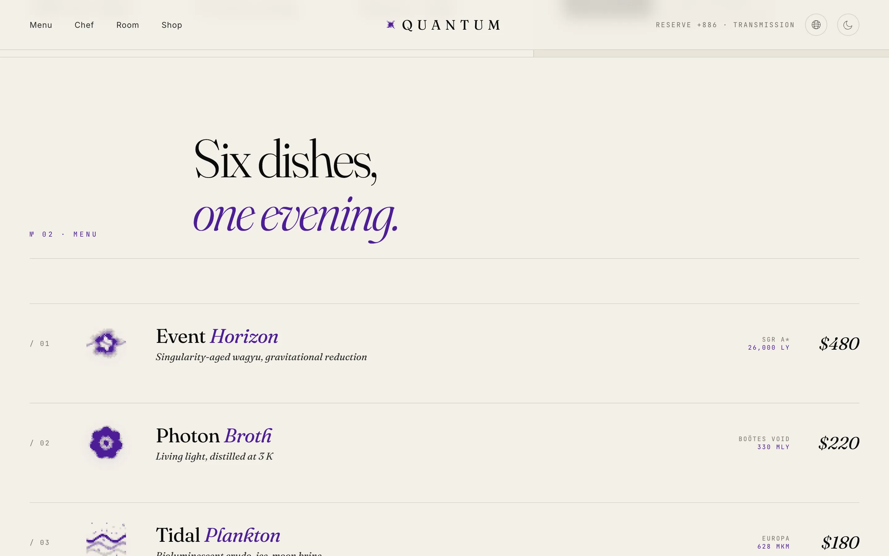
- Dishes with dithered glyph illustrations
- 4-step
- Mobile-first checkout flow
- ≤10%
- Quantum violet coverage cap
Background & Challenge
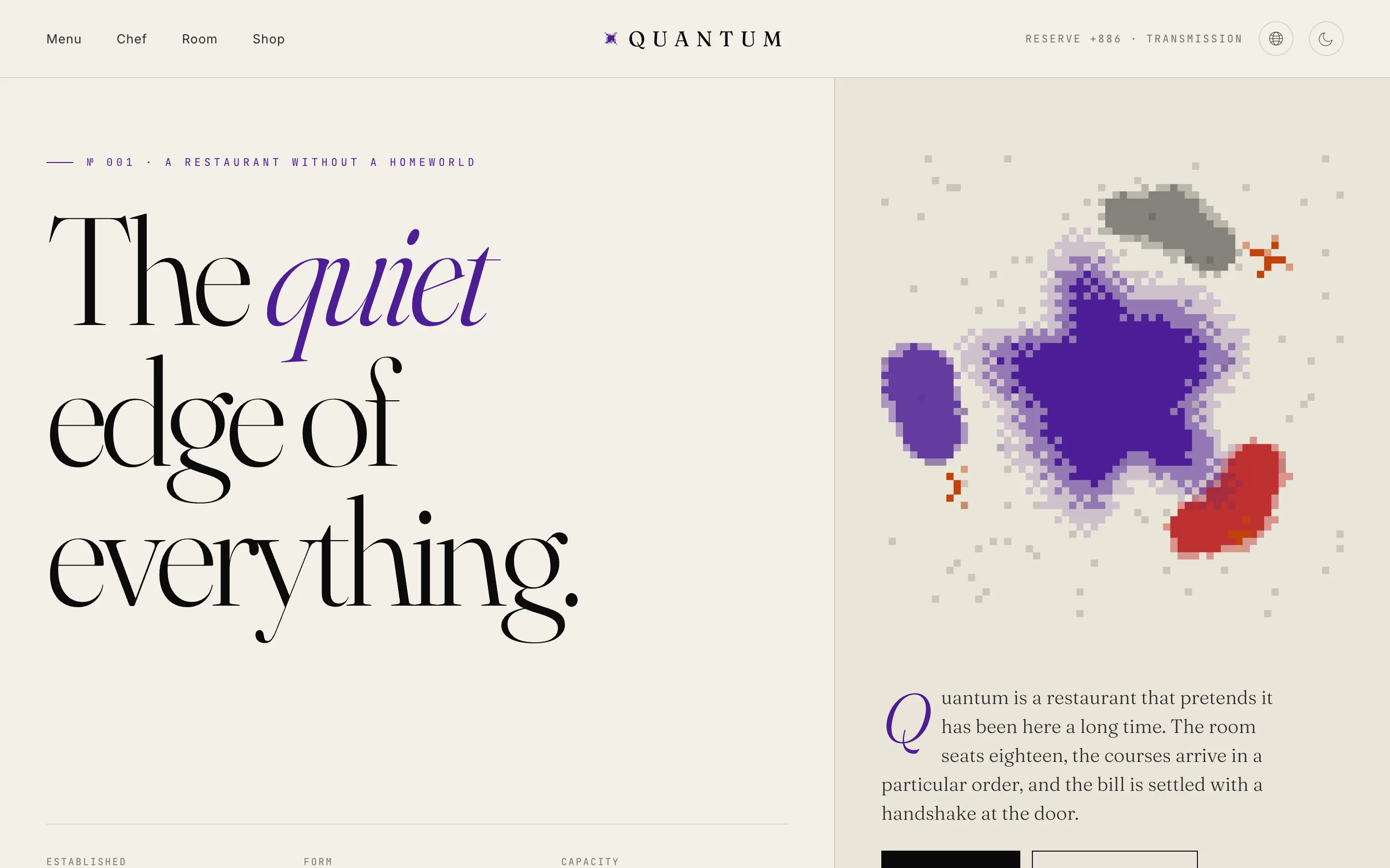
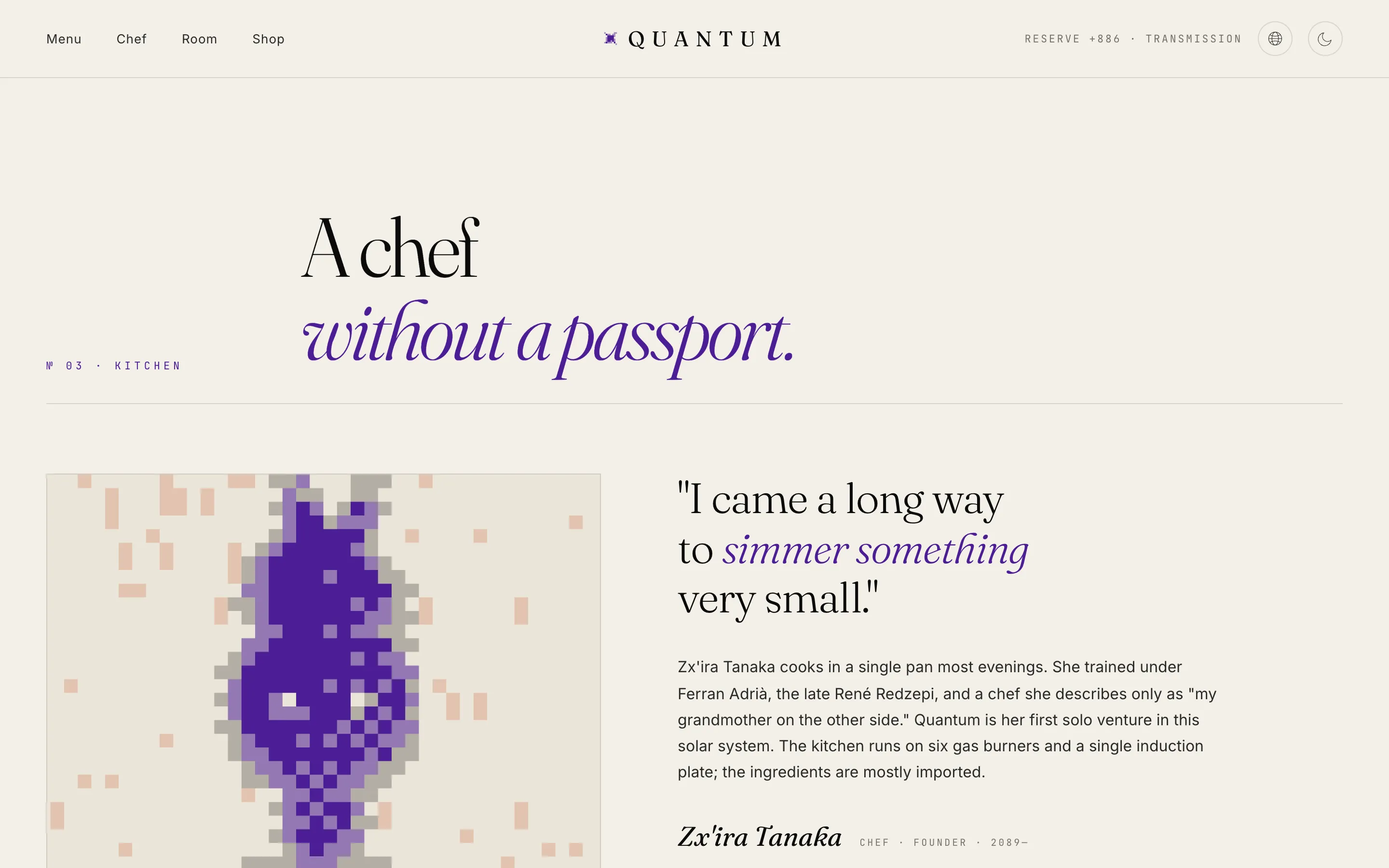
Quantum is a quantum fine-dining restaurant “without a home planet,” perched at the silent edge of everything. The website’s job is not to explain the food, but to build an atmosphere of calm, precision, and surreal luxury—then convert that belief into reservations and purchases.
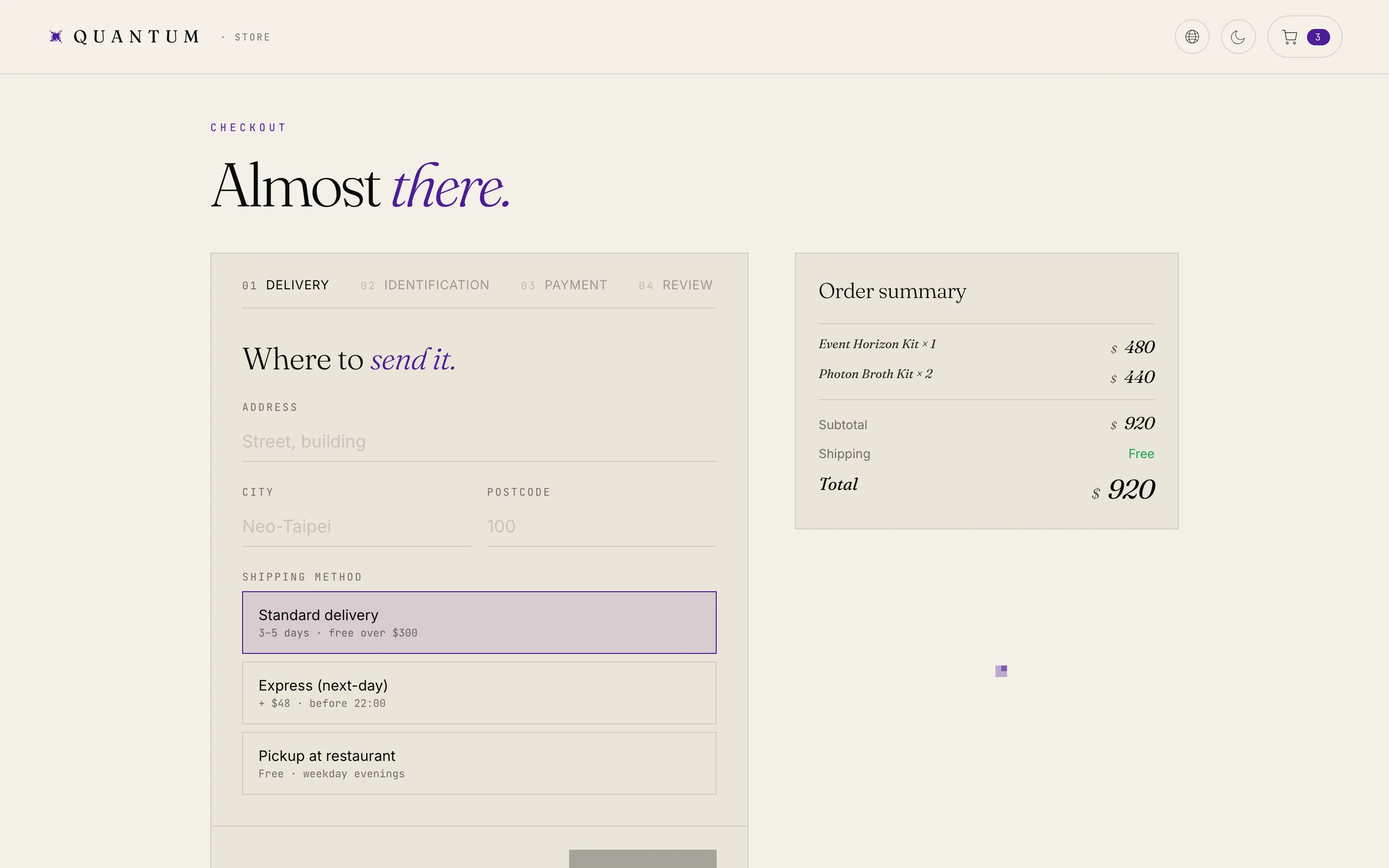
The challenge is that it serves two kinds of readers: brand visitors come for the atmosphere and need an editorial landing page that unfolds the worldview at its own pace; buyers are already convinced and head to /order for meal kits, wine, and merchandise, expecting a mobile-first, friction-free flow. Two interfaces with very different personalities must still speak the same language—exactly the problem a design system exists to solve. The side-by-side Traditional Chinese and English is a brand statement, not an add-on feature.
Design Decisions
Outcome & Reflections
The result is a React + TypeScript + SCSS project: an editorial brand landing page plus a complete ordering journey from store to four-step checkout, with built-in light/dark themes and bilingual side-by-side text, handling contrast and prefers-reduced-motion fallbacks against a WCAG 2.1 AA target.
Looking back, the biggest lesson was “write the worldview first, then set the rules”: with a north star and an explicit anti-list, component-level trade-offs got faster—whenever I wanted to add a shadow, I first asked whether it should be a hairline instead. A fictional restaurant with nothing to photograph forced a second lesson: a homegrown dither engine let the brand grow its own illustrations, so the visuals became part of the design system—like the tokens and components—rather than outsourced decoration.