An internal design system that gives designers, PMs, and engineers one shared language
Role
Design System Planning、Token Architecture、Component Library、AI Workflow Design
Period
2026.05 – Ongoing
Client
Horizon Information (internal design system)
Scope
Design System、Design Tokens、AI Workflow
Screens have been anonymized
64s
1
Hand-edited source file
41
Shared components
3
Layout shells
2
Token tiers
Background & Challenge
Our delivery process used to be “PM writes the spec → designer draws mockups → engineer rebuilds it,” and something got lost at every handoff. Worse, every color or spacing change had to be made three times over — in the mockups, the spec, and the code.
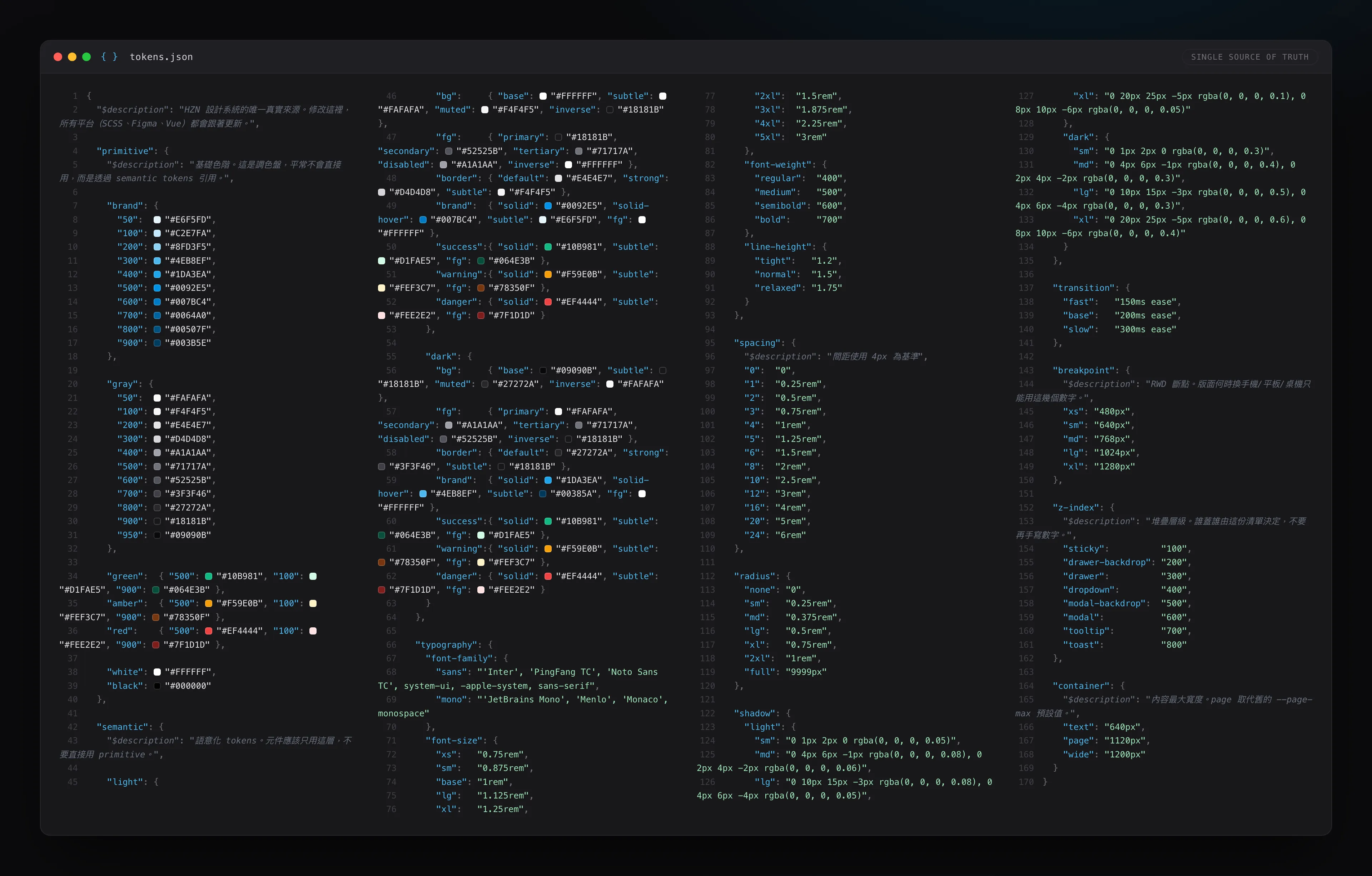
The root cause had nothing to do with mockup detail; it was that the three roles never shared a single source. So I planned the HZN Design System: every design variable lives in one tokens.json, component styles share one SCSS codebase, and both PMs and engineers consume that same source directly. Change one file, and all three sides update together.
Before
PM writes spec
drift at each handoff
Designer mocks up
drift at each handoff
Engineer rebuilds
design file · spec · code — three diverging sources of truth
After
tokens.jsonthe only file edited by hand
auto-sync
SCSS / CSS variables
shared source
PMDesignerEngineer
Change one token, all three update — one source, zero drift
Workflow redesign: from three handoffs and three sources of truth to a single tokens.json that auto-syncs all three roles.
Design Decisions
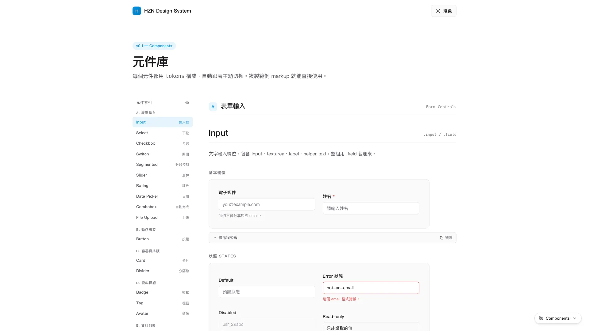
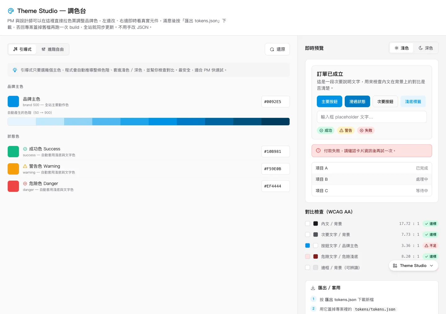
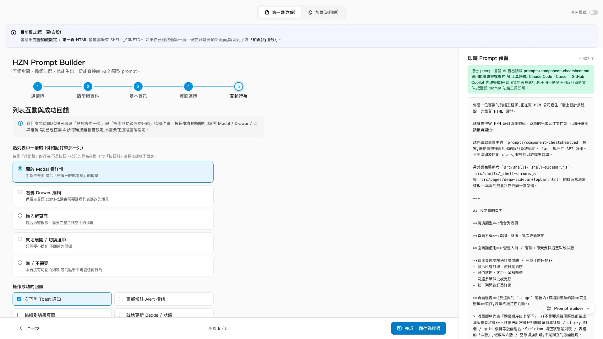
tokens.json syncs to SCSS and CSS through a build script, giving designers, PMs, and engineers one shared source.The component library: 41 shared components across forms, data display, navigation, and feedback — each with SCSS, HTML examples, and a 'when not to use this' note.Theme Studio: pick a color on the left and the scale is derived automatically; the right side previews real components with a built-in WCAG contrast check that flags and blocks failing combinations.A PM completes the five-step prompt builder and copies the prompt; an AI tool then reads the repo and generates an HTML prototype already wrapped in the correct shell.
Outcome & Reflections
The tokens, component library, layout shells, prototyping workflow, and Theme Studio are all in place; the next step is running the full process on a real project. The effect compresses into one sentence: change one token and all three roles stay in sync — PMs stop waiting on designers, designers stop chasing engineers, and engineers stop guessing at design intent.
I also repositioned Figma: it receives tokens one-way only, serving the exploration and communication phase before any code exists. Once something is in code, the code is the only master copy — there is no reverse mirroring to breed a second source of truth.
Looking back, the most valuable part of this project was the process of making architecture decisions in collaboration with AI. Whether tokens should be split into two tiers, what the docs written for the AI should look like, why the AI is asked to “read the repo itself” instead of having rules pasted into the chat — every decision was settled through back-and-forth debate with AI. Those AI-facing docs kept evolving, too: what began as one all-in-one component cheatsheet was later slimmed into a lean index, with the detail pushed down into each component’s own README so the AI only reads the parts a page actually needs — and a lint keeps the docs and the real styles in sync. A design system is fundamentally its rules and boundaries, not the look of its components; articulating those rules clearly enough that neither the AI nor any of the three roles can misread them is this system’s real deliverable.