This was an optimization project for a government fire-safety inspection management system, and I owned the UI/UX design from start to finish. The original screens looked frozen in the 2000s: dense tables crammed into the viewport, a gear-style system entry menu, a heavy visual hierarchy, no responsive design, and no dark mode — a real burden for people on long shifts, some of whom needed to use the system in the field.
But the hardest part of the legacy system was not the visuals; it was the habits users had already formed. So I set myself one principle: preserve the familiar mental model, and only translate the presentation into a modern language. The gear-style system entry, for example, was kept as a motif but injected with 3D icons and a notification ticker — turning it from “dated” into “characterful.”
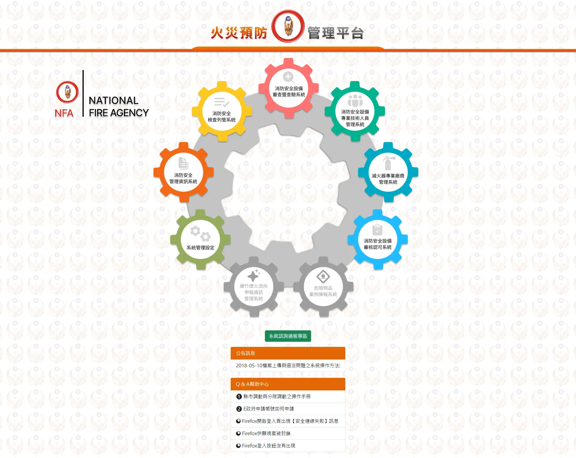
Before
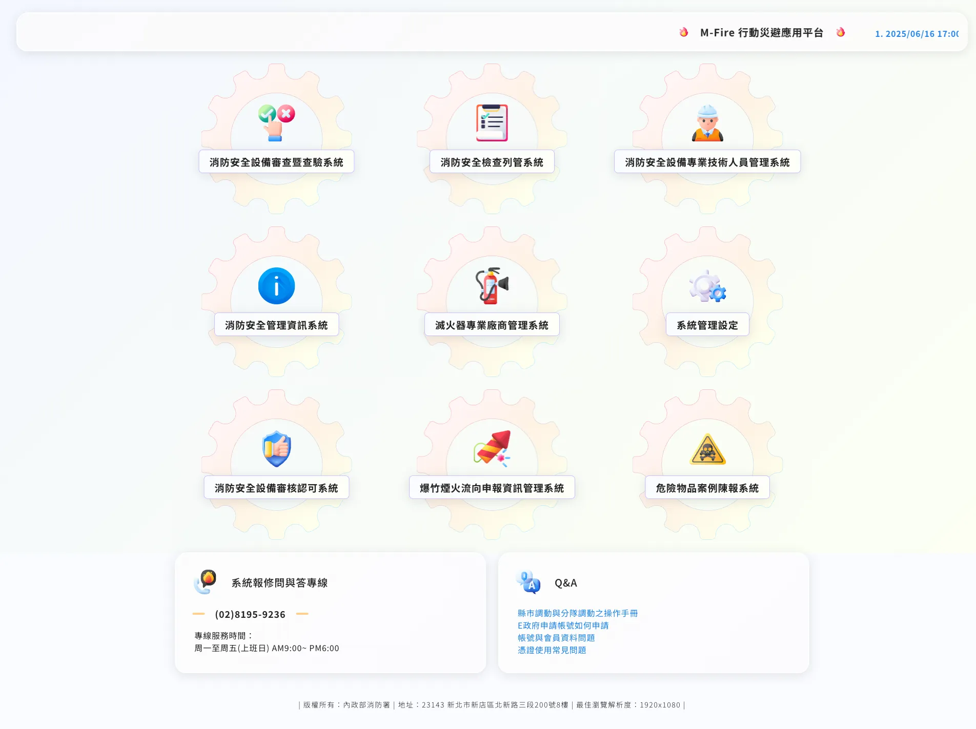
After
System entry: keeping the familiar gear motif, reimagined with 3D icons and a notification ticker
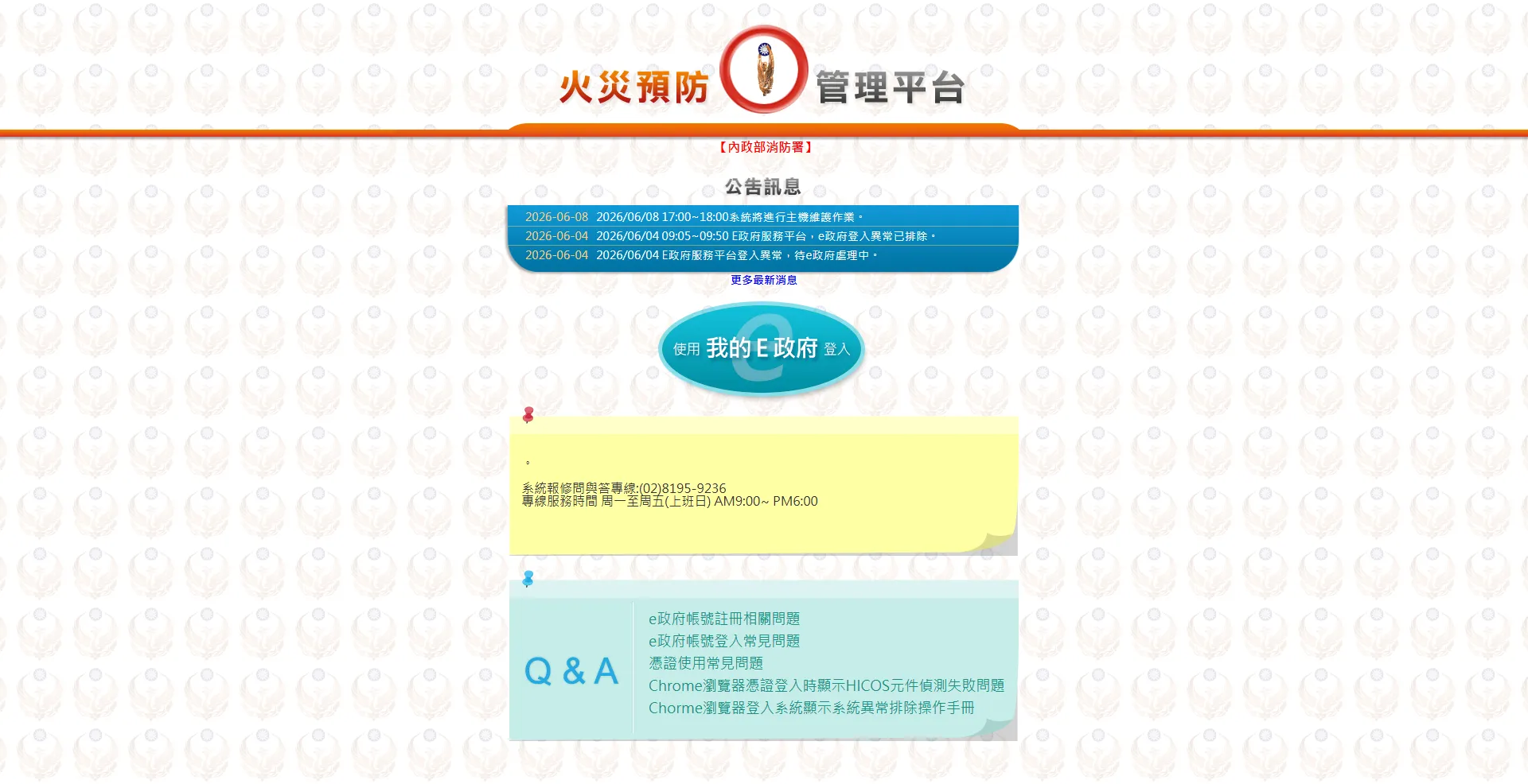
Before
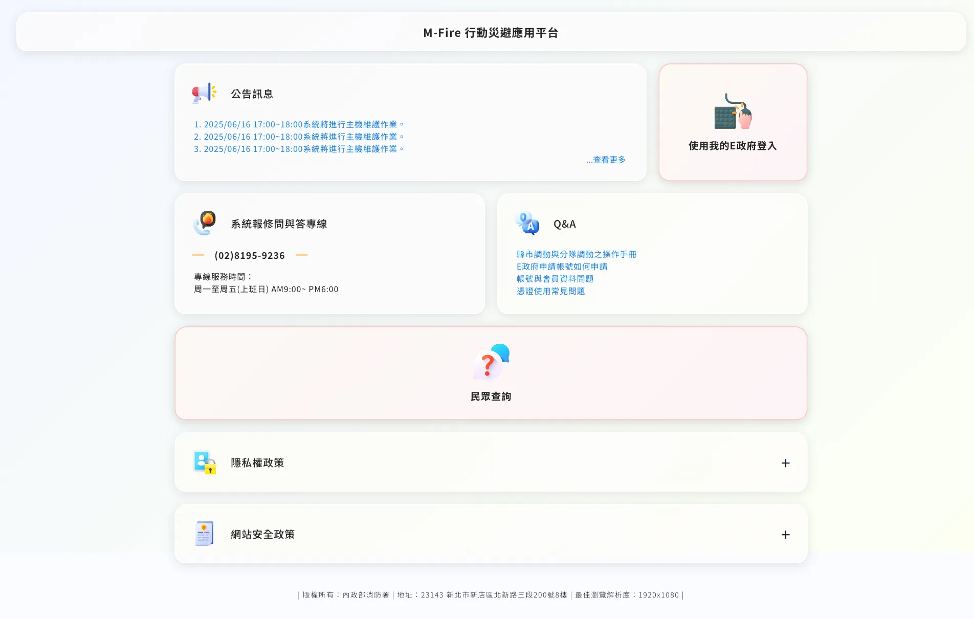
After
Login portal: from a boilerplate announcement page with a single login button to card-based entries differentiated by state
Design Decisions
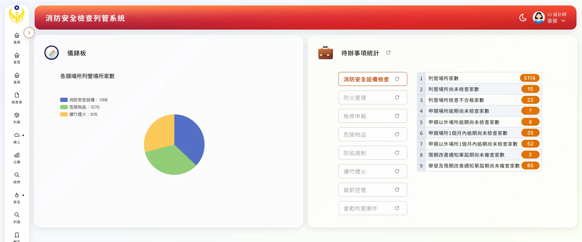
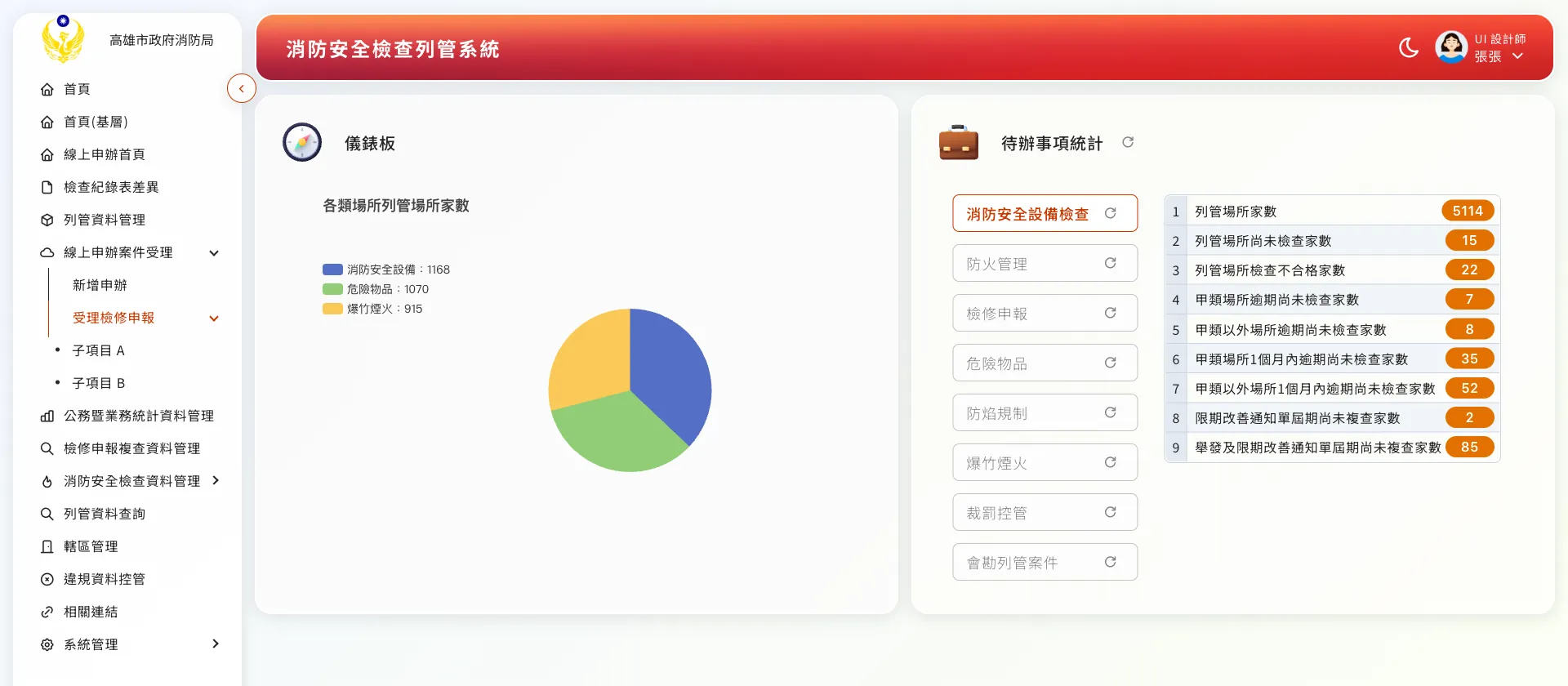
The redesigned inspection dashboard: a pie chart of registered premises on the left, tag-filtered to-do cards and a drillable chart on the right.The collapsible three-level sidebar: the full hierarchy when expanded, icons with short hints when collapsed, and tooltips for longer items.
Outcome & Reflections
After the overhaul, the system went from a desktop-only legacy platform to a modern back office that stays clear and usable on any device. Alongside it I delivered a design guideline document and markup specifications, defining shared patterns for empty-state illustrations, descriptive result dialogs, and toasts, so later development and expansion had a consistent reference.
The lesson that stayed with me most: modernizing a legacy system is not about overthrowing it, but about translating it. The gears, the tables, and the paper workflows users knew are all still there — just translated into a clearer, less taxing interface language. Holding that balance within the constraints of a government project was the most valuable practice this case gave me.